Cognitive load reduction
Our decision to default all screens to the "Chunking" methodology for persona-driven screen design.
We used the chunking UX concept to help reduce cognitive load on long, dense pages:
Finding: Our SME Pannel demanded long pages with vast information at their fingertips.
We visually grouped fields with each other
We provided a heading for each chunk
We used the chunking method on the various “details” screens: Order Details, Patient Details, Project Details, and Subject Details.
Nielsen Norman Group proposes that the chunking method is effective:
“Presenting content in chunks makes scanning easier for users and can improve their ability to comprehend and remember it.”
Nielsen Norman Group proposes that the chunking method is effective:
Image: low-fidelity wireframes defining “chunks” for an improved Order Details page. We used sticky notes and labels to record ideas and context with our SMEs rapidly.
Examples
Image: our high-fidelity Order Details page design (upper portion shown.)
Results
Large Feature Example: Flags
We helped the Product Owner author a robust new feature called “Flags.” The Flags design aimed to reduce cognitive load in the following ways:
By utilizing a right-hand Flag Panel, we visually and functionally contained the Flag content.
Had we treated Flags with the same structure as other content on the page, it would not have eased cognitive load. It would have forced the user to scroll down through each Flag, raising anxiety.
The side-bar for Flags also allowed the user to immediately access supporting data found elsewhere on the page. By keeping a cognitive bookmark of the Flag at hand open on the right, they can scan for the key piece of data that can inform their work to resolve the Flag.
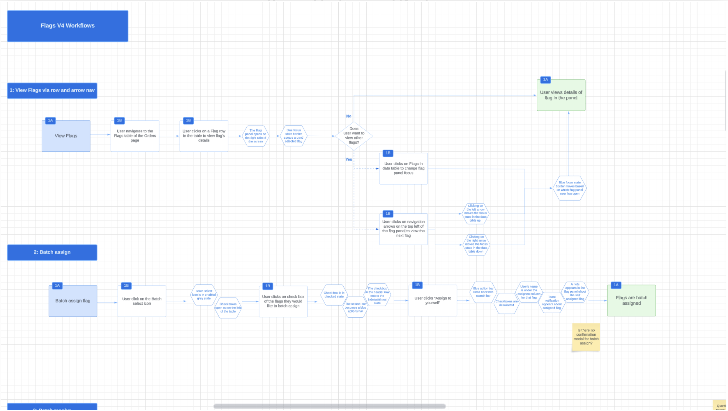
Image: We defined a few user workflows in LucidChart for our new Flags concept.
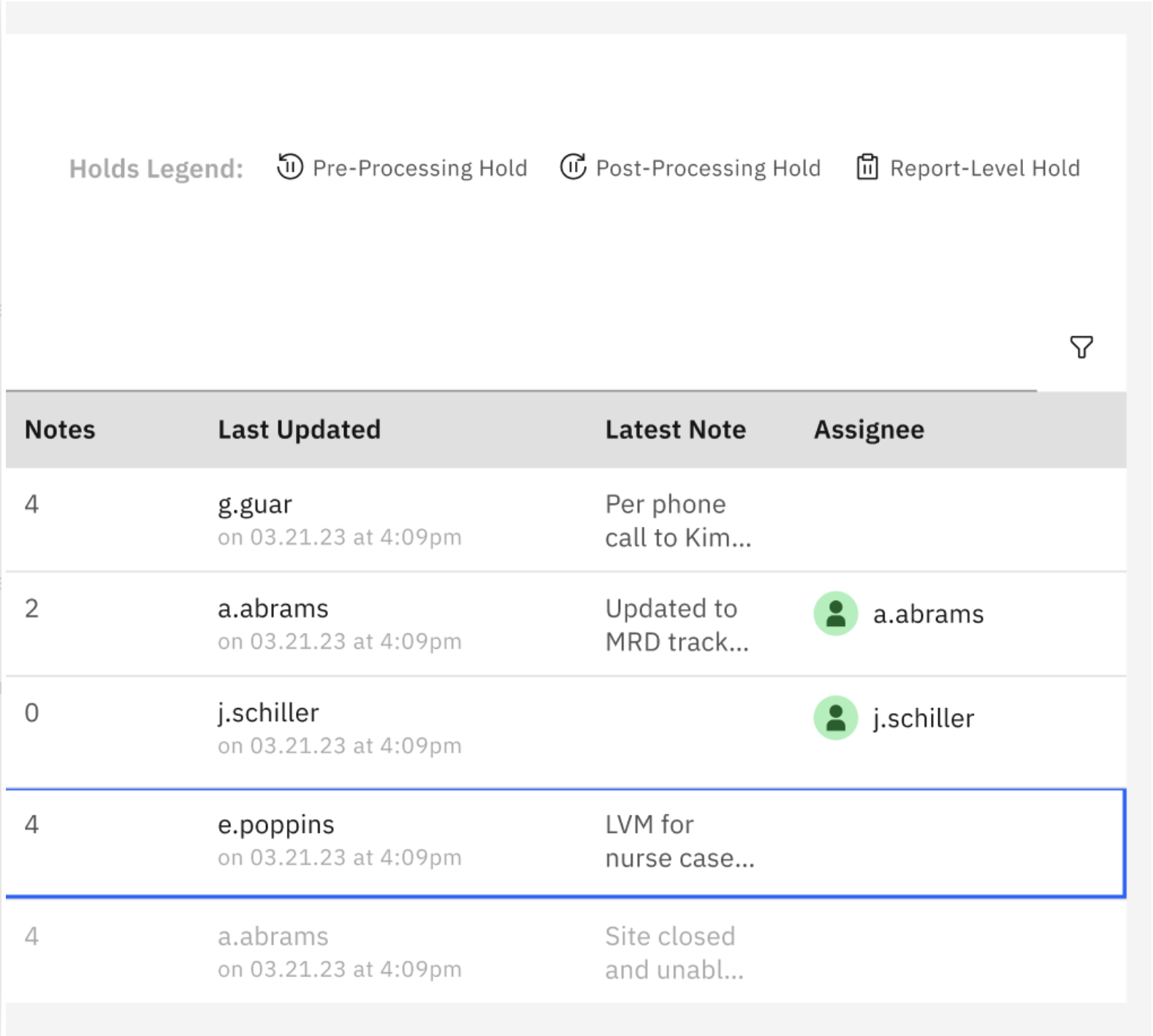
Image: A Flags list on an Order Details page; high-fidelity. This shows our creative use of the Carbon Design system.
Image: The same Flag List is shown here. The user has now clicked on a Flag listed in the table, and the system has responded by opening the Flag Panel, where the user can work on that Flag.
Data Tables: Our New Open-Source library with IBM.
Image: An example of a Data table that we designed.
The repeated pattern of data tables aimed to reduce cognitive load in the following ways:
Recognizing that our users have expert skill and affinity working with data tables and spreadsheets, we surfaced OMS data into the thoughtful table design
Careful column selection and ordering from left to right allowed our users to see exactly the data they wanted to see
The use of tags, icons, color, and a humanized label audit made the data scannable.
Image: An example of a Data table that we designed.
Search in Carbon.
Flow examples
Advanced Search and Filter pattern
On each data table (Order List, Patient List, Flag List, Specimen List, etc.), we incorporated (A) the Carbon Active Search and (B) our custom filter bar, disclosed by a filter button.
The combination of Carbon Active Search with our custom filter bar aimed to reduce cognitive load in the following ways:
Latency problem: We removed the latency problem on screens that came with loading all of the data and instead presented the table in an Empty State pattern. The Empty State directed the user to the search and filter tools to scope down the data set to a set that would be useful to their workflow.
Reduction of Data on Page: By directing the user to reduce the scope of the data set, we removed the anxiety of seeing too much unusable data. We had previously identified that, for most Lists, there was no use case where a user would need to see an unfiltered data set. (For example, there was no use case in which a user would want to see all Orders. Instead, they may only be concerned with active Clinical Trials Orders.)
Customized Filer Bars for specific personas: By working with our SMEs to thoughtfully select some choice filter fields for each list, we ensured that the filter bars would be useful and serve real scenarios for interacting with data.


